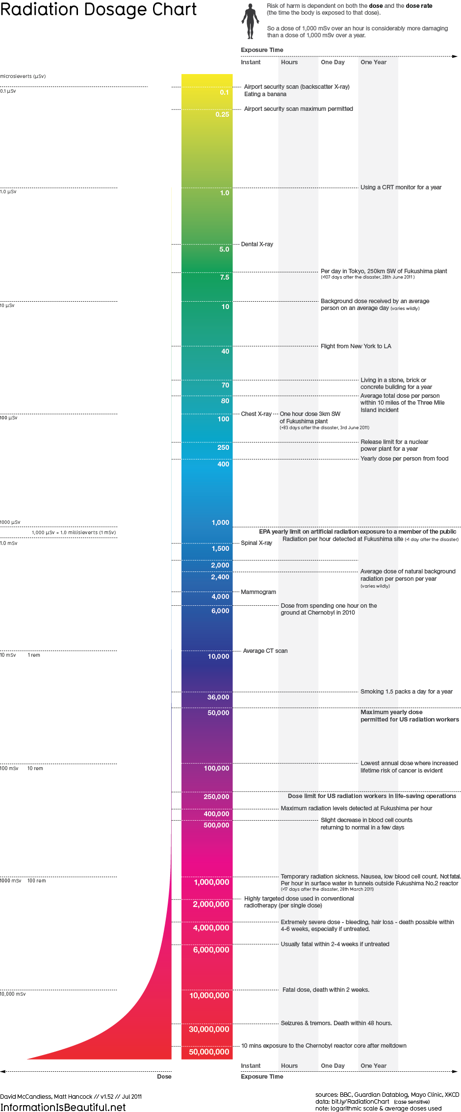
Do you ever wonder how your CT scan or mammogram measures up to the radiation you recieve from an airport security scan or by living next to a nuclear power plant? InformationIsBeautiful.net created this chart to keep things in perspective:
You can view the original chart at InformationIsBeautiful.net or the data on their GoogleDocs page.
Interested in seeing more radiation dose charts? Check out the one at xkcd.com.